Role
Timeline
July 2024 - September 2024
Introduction
The Reason Grumble was Created
As someone who identifies as a foodie and busy human, it can be the most frustrating situation when you are hungry yet indecisive about what to eat. I wanted to create an app for something that I am passionate about --- food! The intention of the app is to ease the decision-making process when choosing where to eat out. Read on as I learn in my journey of designing Grumble that there are many factors that go into it from mood, to time, to the people involved in the decision.
Research
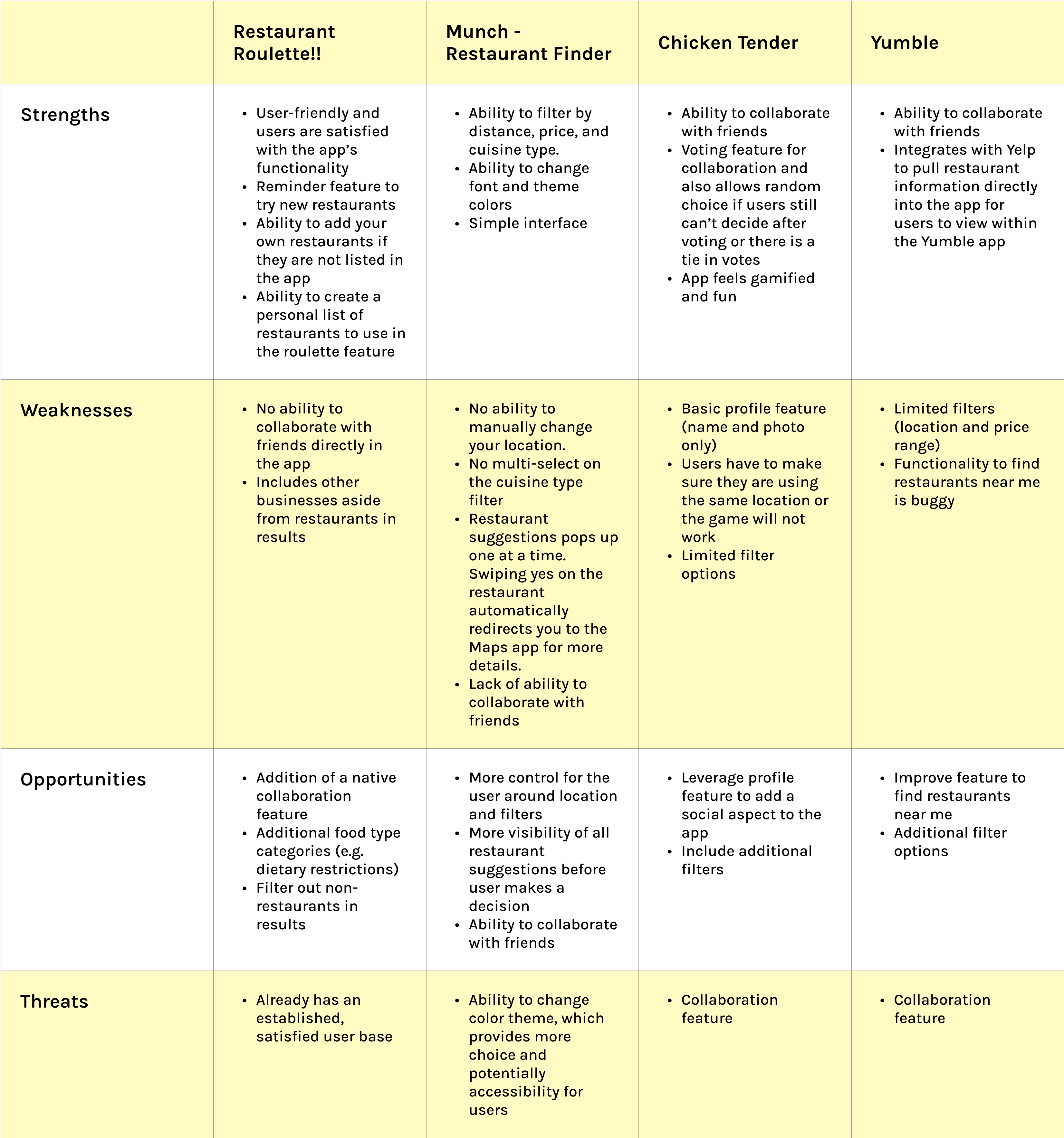
Researching the Competition
Competitive analysis was performed on four direct competitors to understand the needs of their user base, what features were currently offered in the market, and where there were opportunities to create a better performing app.
User Interviews
5 users, aged 28-33, were interviewed over Zoom about their decision making process when choosing something or somewhere to eat. They were asked questions about what a typical meal looks like for them, what emotions are felt during the decision process, what factors contribute to their decision, and to give examples of times when it was easy and hard to make a decision.
Insights

Visual Aids
High importance on photos and visuals from Yelp/Google/Instagram.

Users seek tailored suggestions to simplify decisions, especially when unsure or craving something specific.


Preference for Familiarity
Familiar places are a common fallback when users are overwhelmed or indecisive.

Indecisiveness and Overwhelm
Too many options lead to decision fatigue, often resulting in fallback choices like home cooking or familiar restaurants.
Complexity in Group Decisions
Group dining is complicated by differing preferences, often resolved by choosing familiar spots or relying on external recommendations.
Analyze
Finding Themes
In order to visualize patterns and themes from my user interviews, I created an affinity map.
“It can be hard to balance friends' tastes. We might end up just going to a familiar place or I will send restaurants I have on my list to try and then they will vote in our group chat.”
“By the time I come to a decision, sometimes everything's closed, or I'm just too exhausted at that point, so I usually just give up.”
“It’s hard to decide when I’m not craving anything specific. I usually default to familiar places or habits to keep things simple.”
User Persona
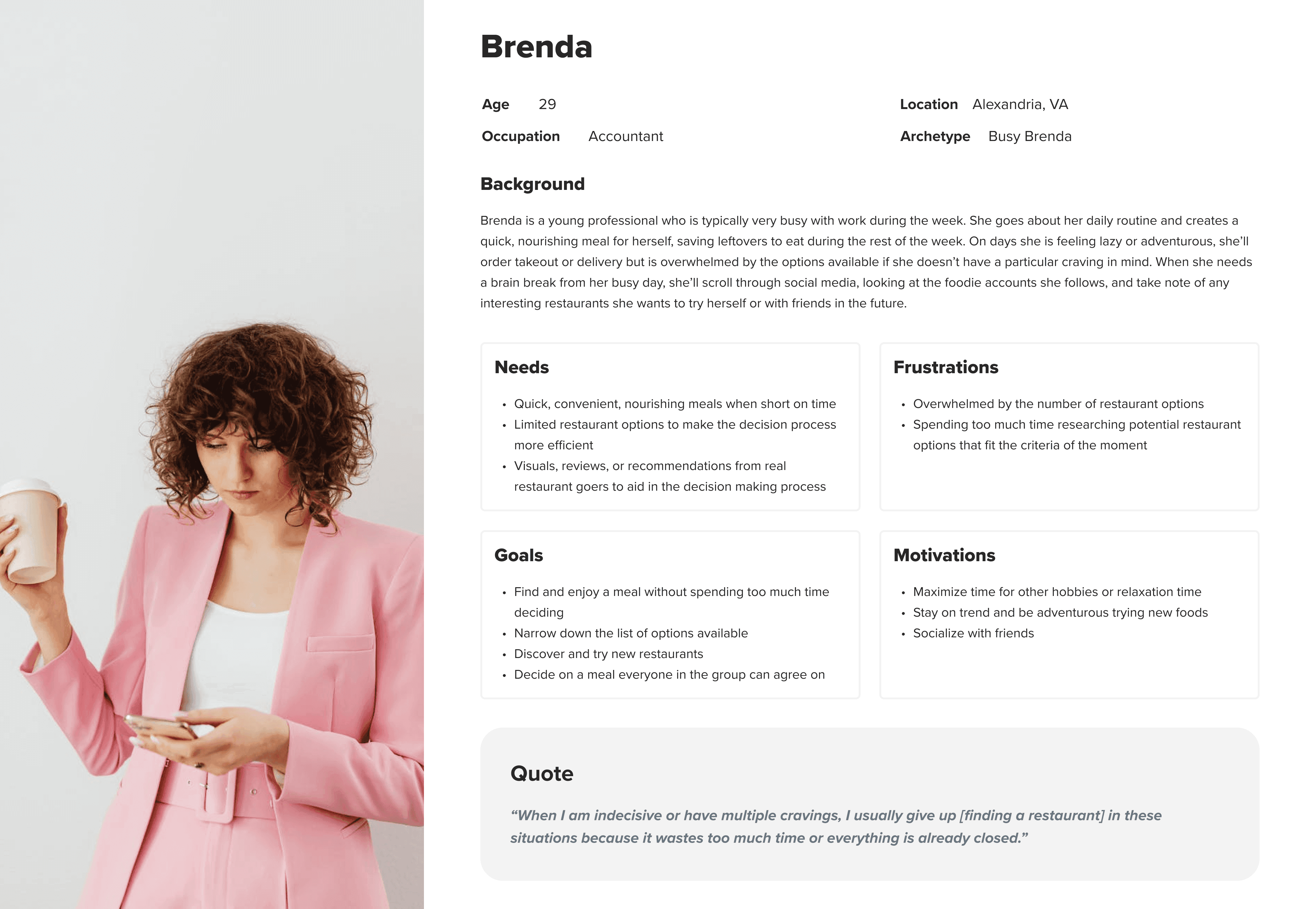
The user persona was created based on the demographic interviewed. It encompasses the needs, goals, frustrations, and motivations of working millennials that are influenced by social media. They try to make convenient, nourishing meals for themselves but have times where they will order takeout for themselves or go out to eat with friends. These are the times where, if they don’t have a specific craving, need help narrowing down their options.
Problem Statement
Unless there is a craving in mind, users typically have a difficult time deciding what to eat. The situation is sometimes made even more difficult when there are multiple people involved and you have to please everyone’s palettes. Sometimes so much time is spent trying to decide on somewhere to get food that the user will become frustrated and abandon the plan entirely, defaulting to cooking something simple at home or buying something quick and convenient from somewhere they have been before. There is an opportunity to help make the user’s decision-making process more efficient so they have more time for other daily tasks and are not frustrated when they end up abandoning their initial plan.
Ideation and Prioritization
Feature Set
The “Must Have” features were selected as shown because these were features that could help users narrow down their restaurant options and speed up the decision process. Additionally, none of the existing apps researched offered both a feature for a single user and a collaborative aspect to vote with friends. Based on my research, it was important to offer both features because users encounter both situations, and the factors considered vary depending on either situation.
Must Have
Filter restaurants
Location services + location search
Swipe to vote
Randomize choice
Lists/Collections
Invite friends to collaborate
Yelp integration
Should Have
Mark restaurant as tried or not
Could Have
Rate restaurant recommendation
Create profile
Collaborative lists
Will Not Have
Pre-created lists
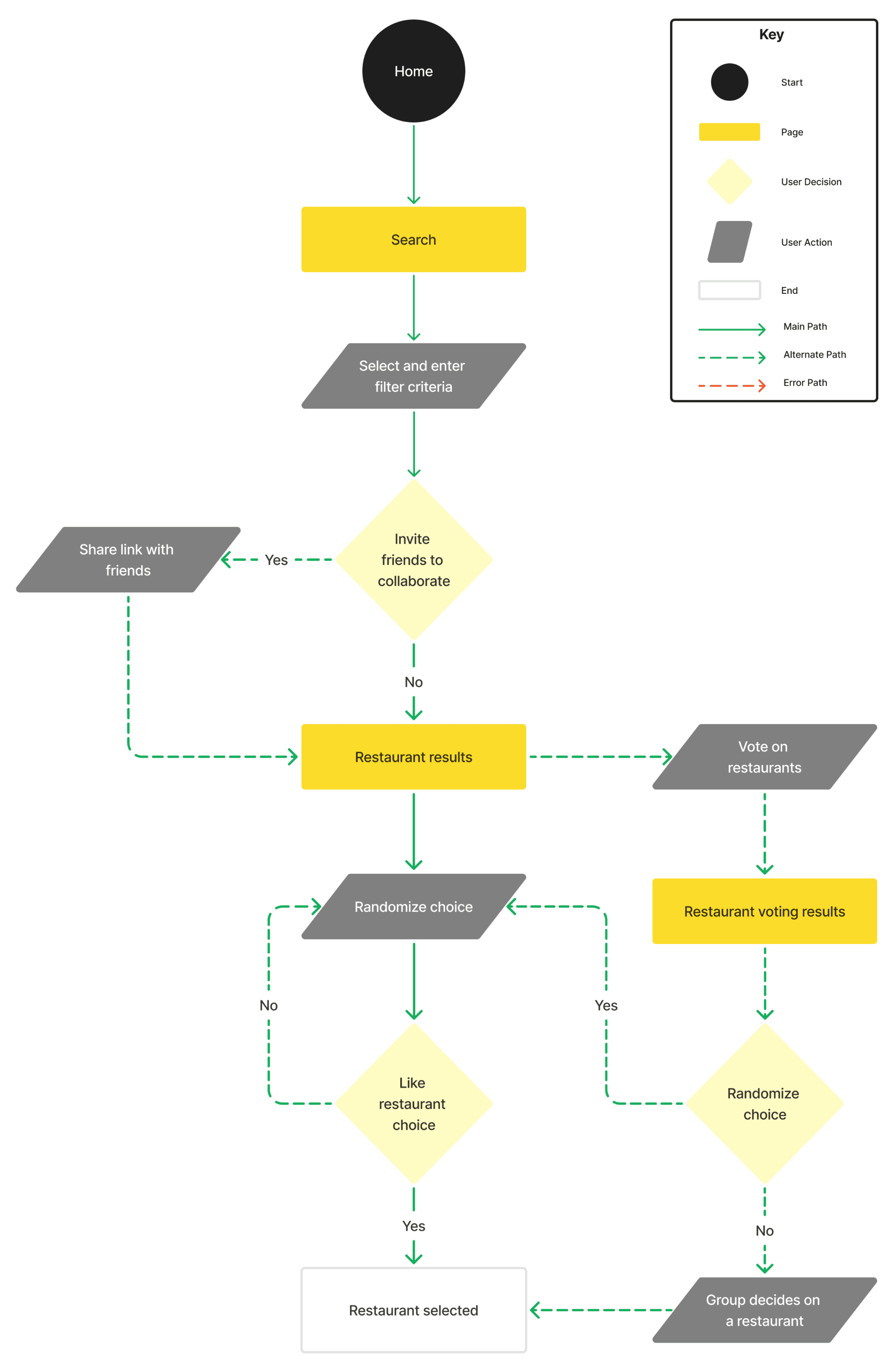
User Flow: Search for a Restaurant (Individual + Group)
Before designing screens, I had to think about what the user flow would look like, which would then inform the key screens that needed to be designed. The flow chart below is the original user flow envisioned during the project. The flow evolved as I created initial wireframes, received feedback, and iterated.
Design
Low-Fidelity
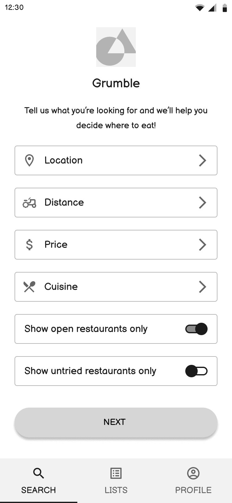
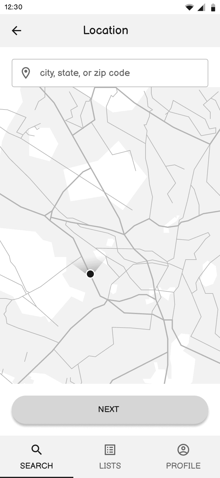
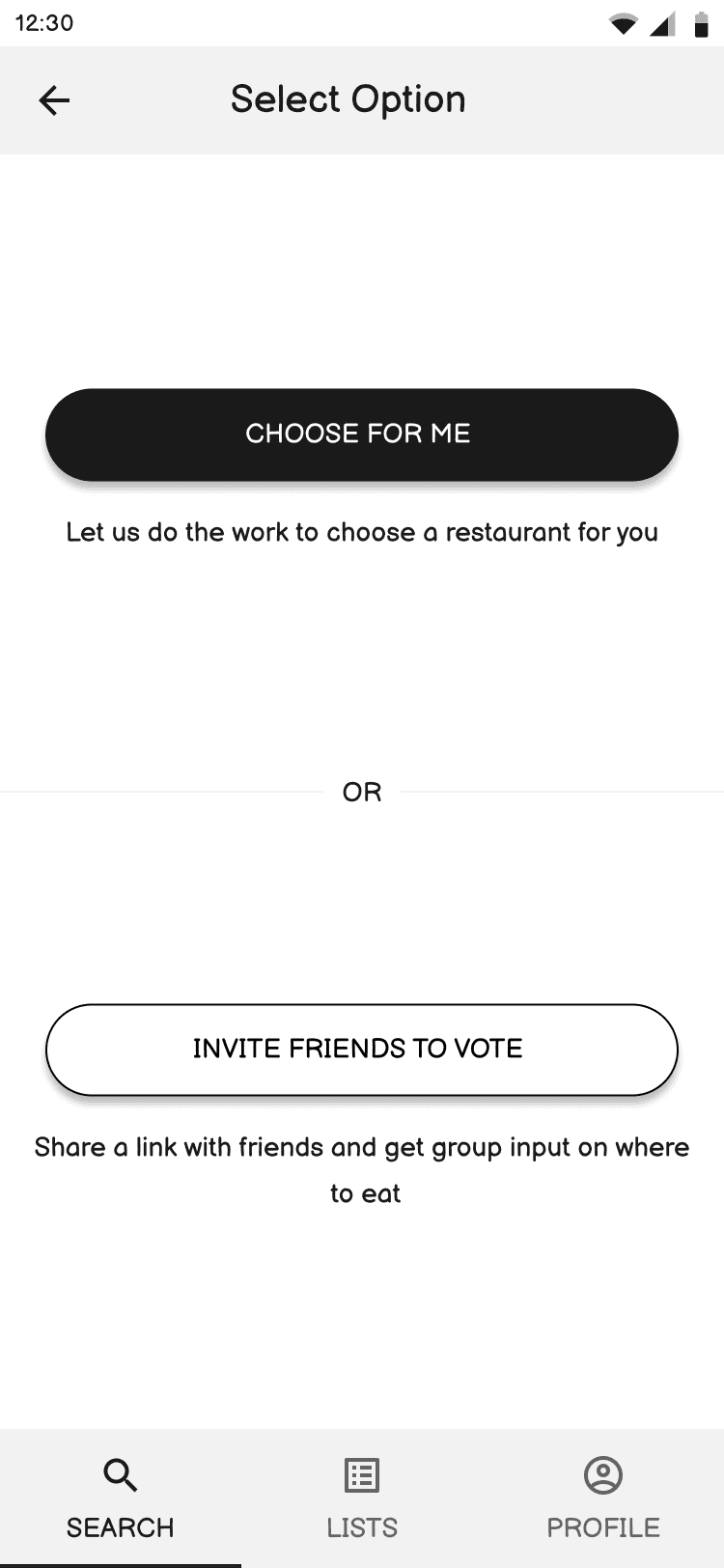
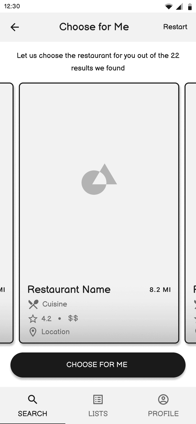
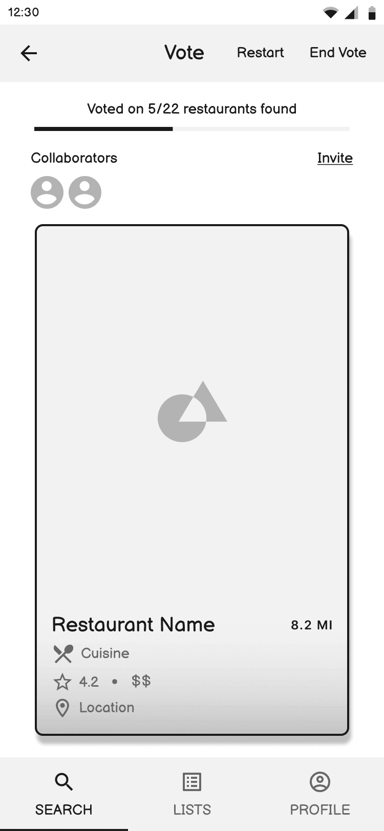
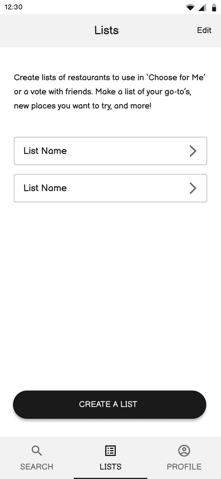
I decided to digitize the lo-fi wireframes in preparation to have a more realistic product to show users for initial testing. I’ve found in my first few projects that showing sketches requires more user imagination and yields less impactful feedback.
Home/Search
Location Filter
Choose Individual or Group
Randomize Choice
Vote with Friends
Lists
User Testing
User testing was conducted with 4 users virtually through Zoom. Users were asked to view the basic low-fidelity prototype in Figma and complete 3 task flows:
Choose a restaurant for yourself
Decide on a restaurant with friends
View restaurants you have saved
Low-Fidelity Iteration Based on User Feedback
Preference for vetting restaurant options over complete random selection
3 users expressed a preference for vetting the restaurant results before submitting them for random selection or sharing with friends to vote.
Before
After
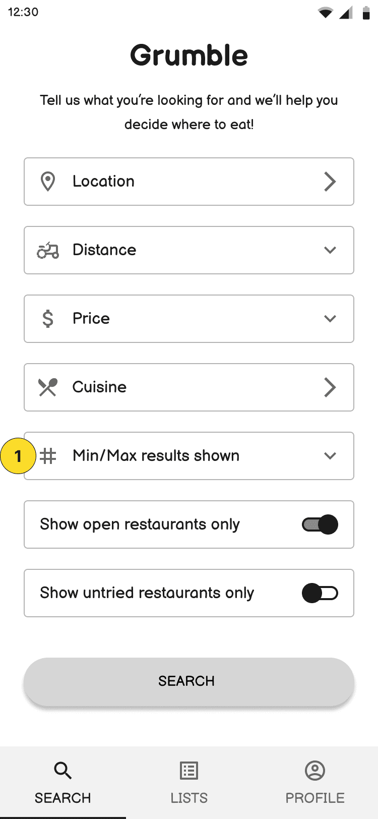
Additional Filter to Limit Results Shown
2 users expressed that adding a filter to limit the amount of results shown would be helpful to not have to go through and vet too many restaurant results.
Before
After
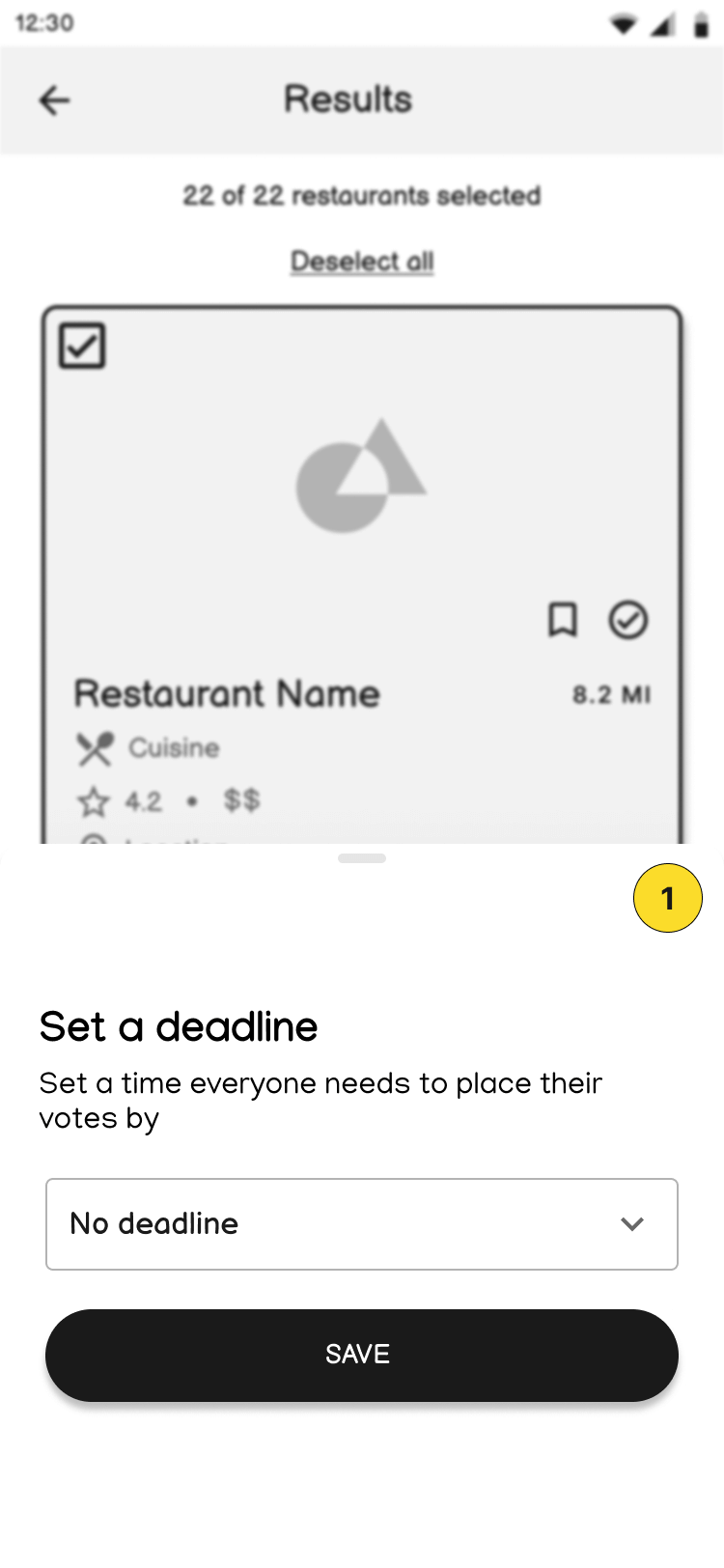
Improvements to Voting Functionality
3 users expressed the need for a feature to set a time limit for all users to vote by.
Before
After
Branding
Building the Brand’s Identity
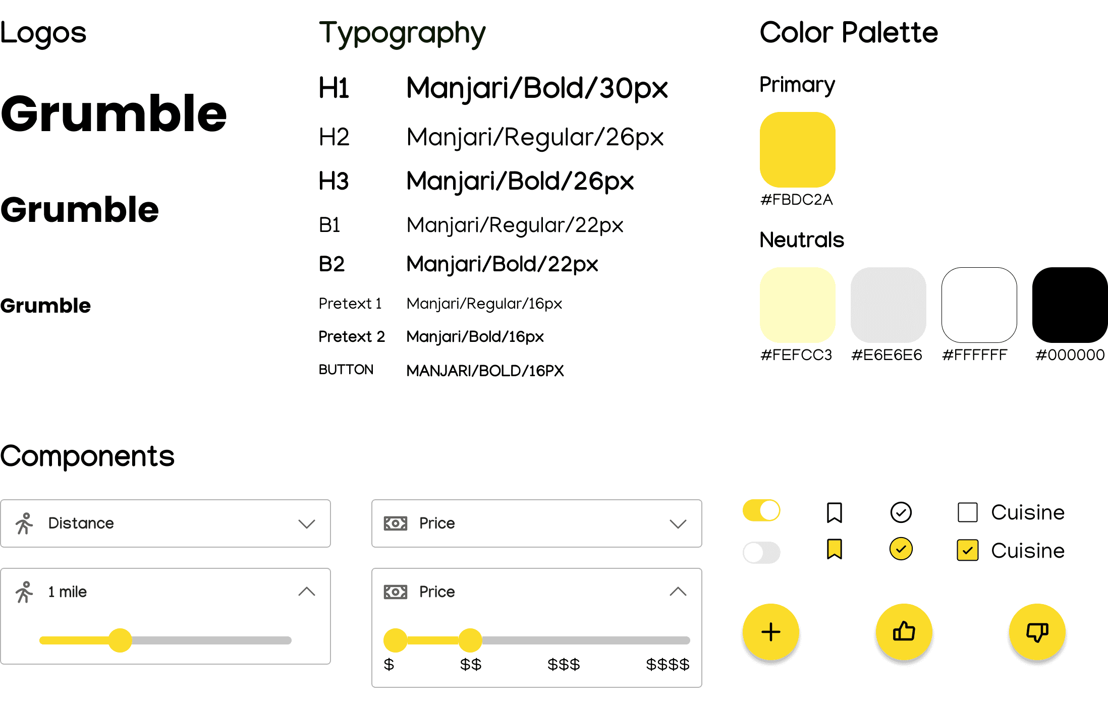
The app name, Grumble, was chosen to match the purpose of the app and keep the tone light and fun. Values and brand colors were chosen based on user interviews. Users had said they feel excited when they know what they want to eat or are excited about a meal. I wanted to channel that excitement through the color palette of the app. I used the WCAG Color Contrast Checker to confirm colors comply with AA and AAA standards.
Iterations
High-Fidelity
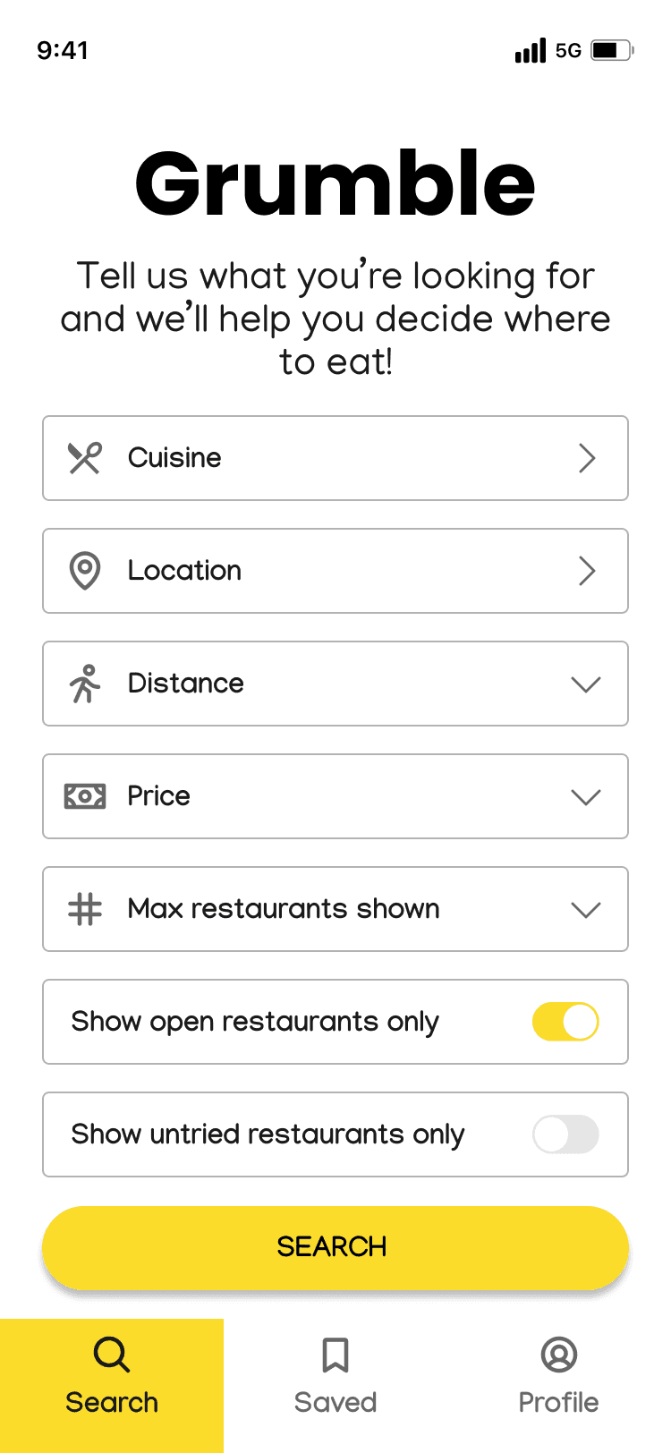
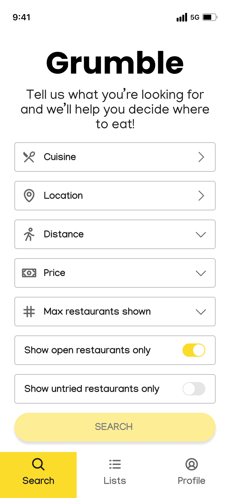
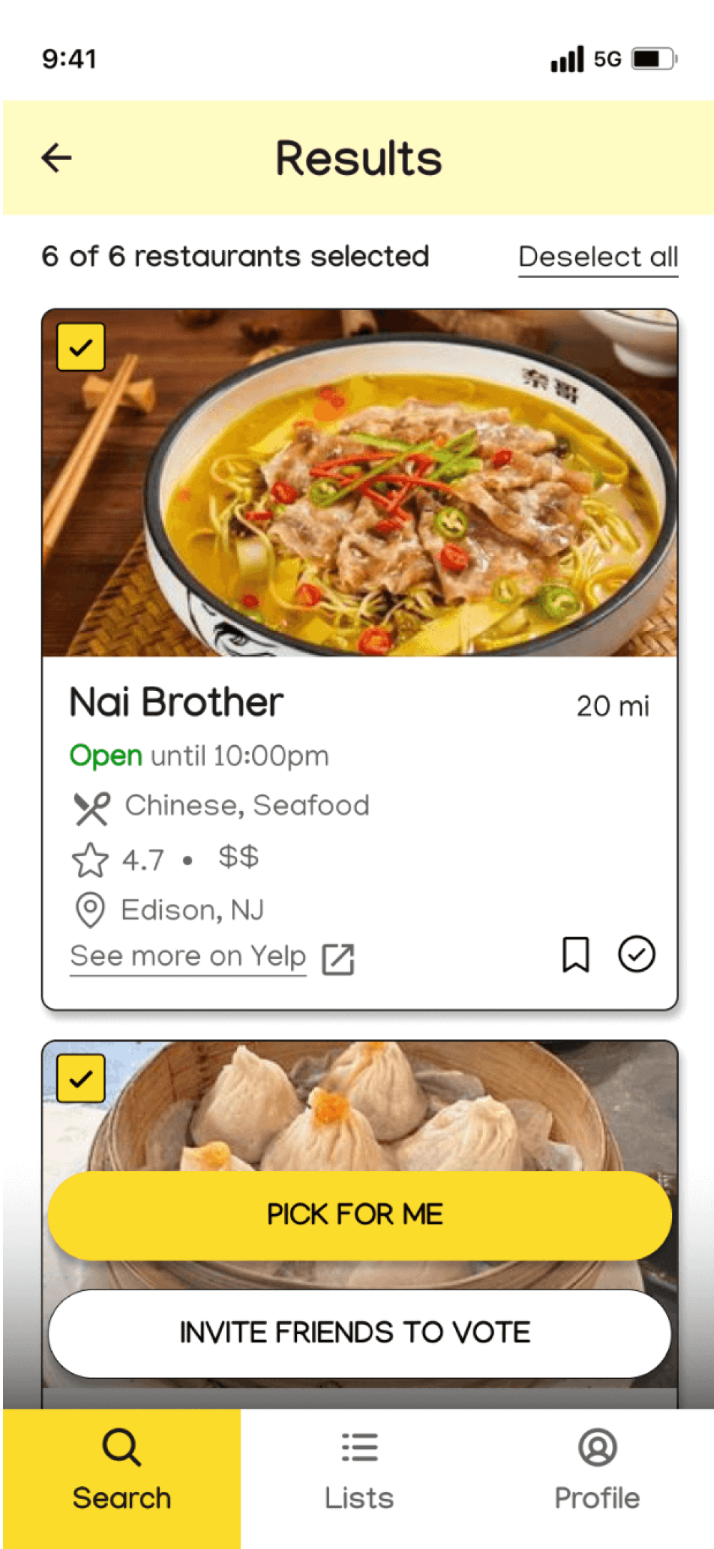
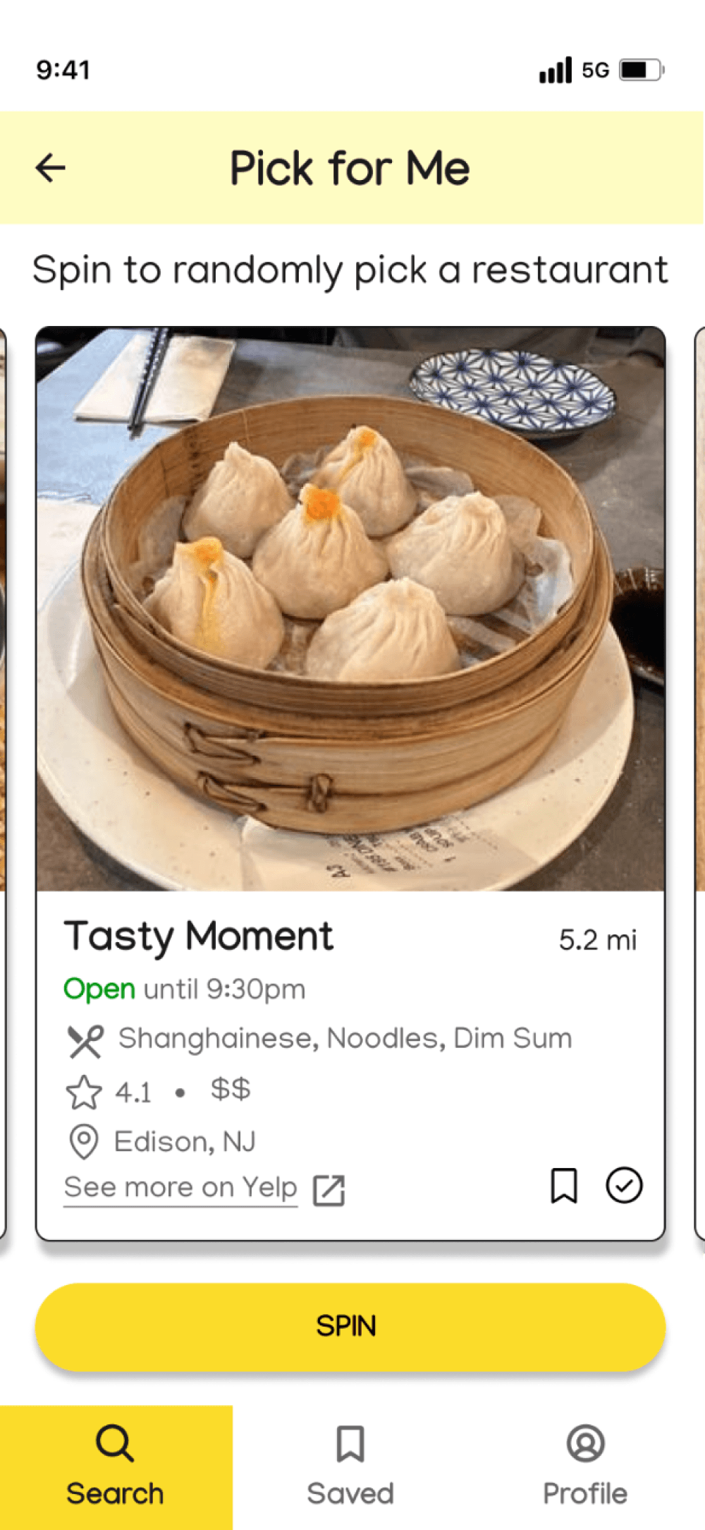
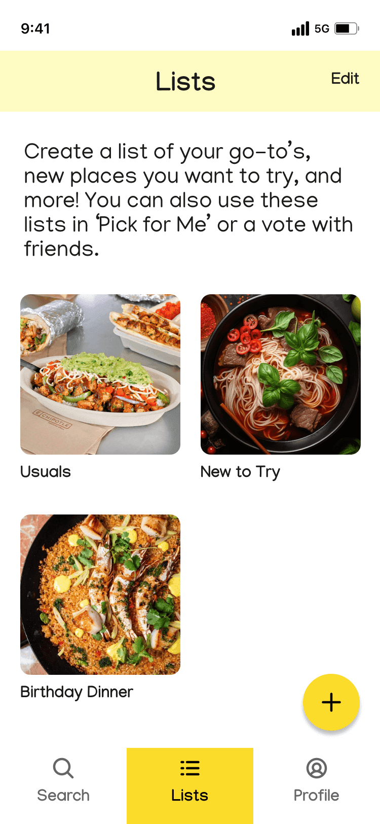
Branding elements were then applied to lo-fi screens resulting in the below key hi-fi screens.
Home/Search
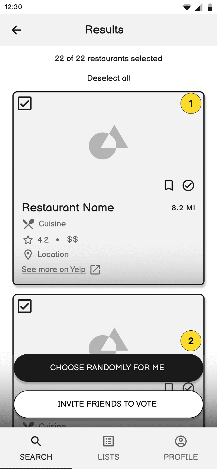
Restaurant Results
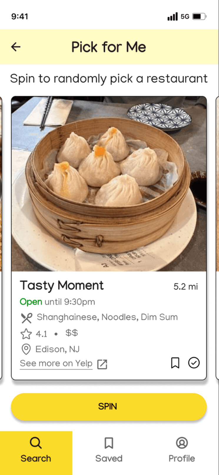
Pick for Me
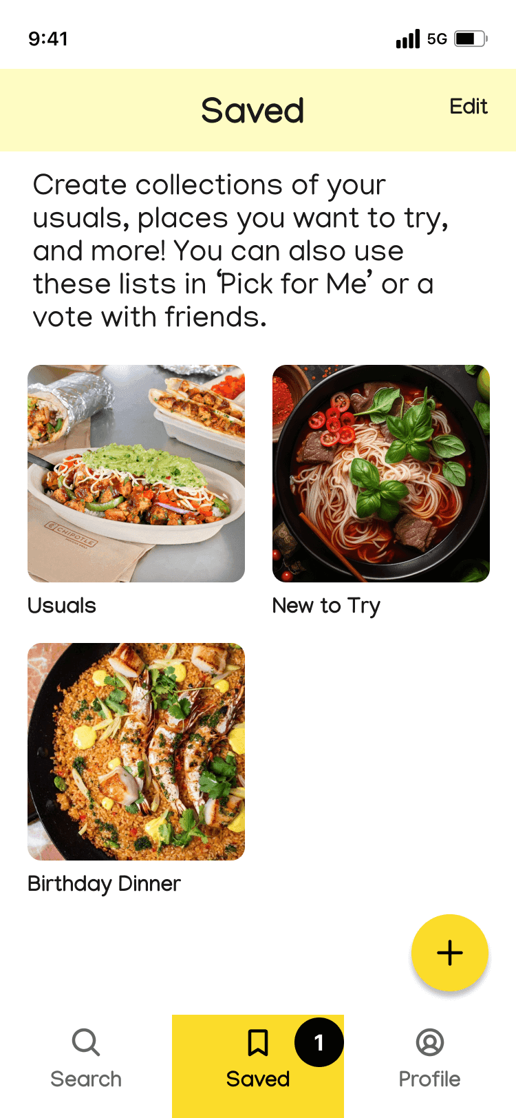
Lists
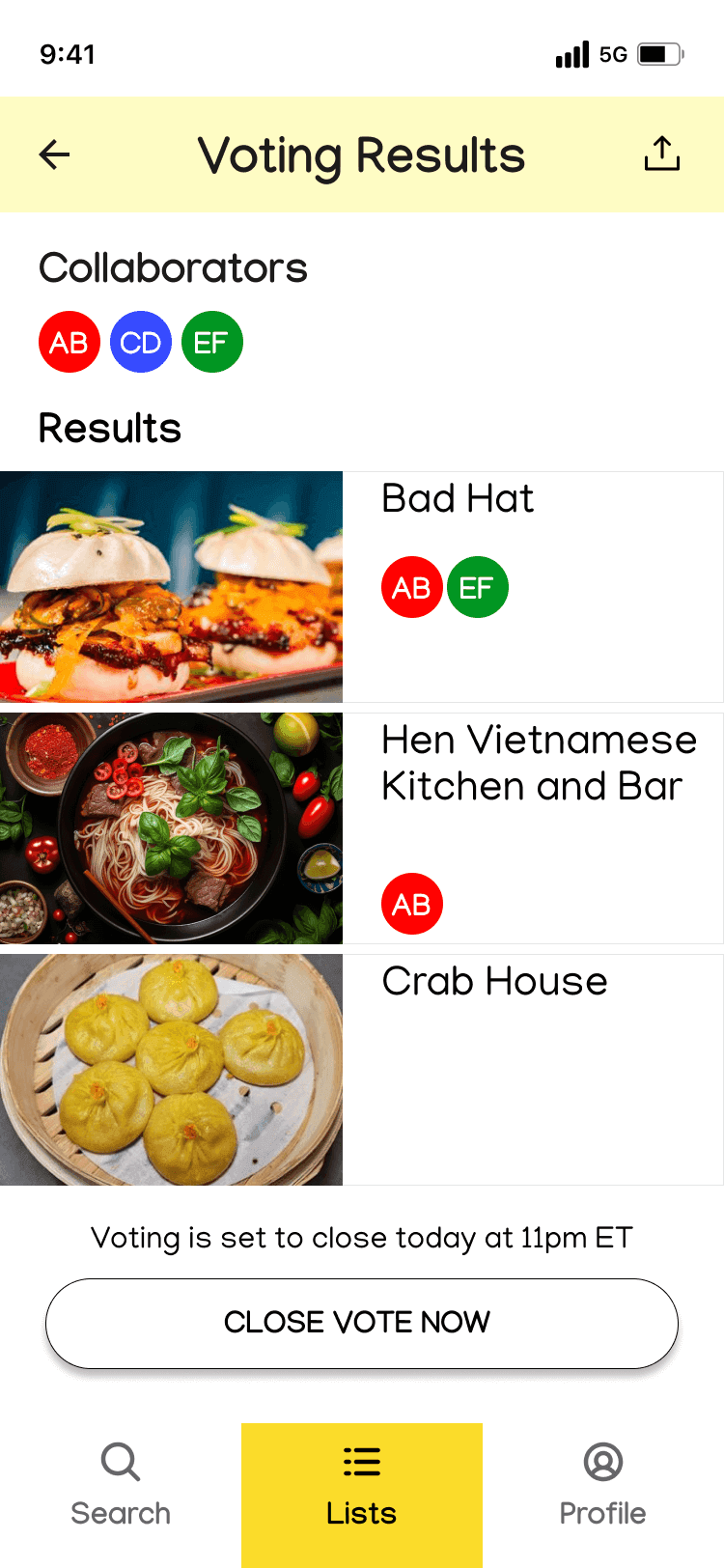
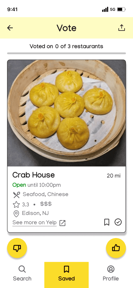
Vote with Friends
Voting Results
Usability Testing
6 users, aged 28-33, were provided a link to complete an unmoderated usability test using Lyssna. 4 of the 6 users previously participated in initial user testing of the lo-fi version of the app, while the other 2 users have never had exposure to the app before. Participants were asked to complete the following tasks.
Take 2 minutes to explore the Grumble app
Generate restaurant results
Pick a restaurant for yourself
Use a list to decide on a restaurant as a group
Insights

Users found the app generally intuitive, easy to use, and aesthetically pleasing. The filter options and screens were well-received.

Spin Functionality
2 users misunderstood the “Pick for Me” feature, thinking the next screen auto-selected a restaurant instead of them needing to click “Spin”.

Filter Controls
Most users used the filters as expected but 5 of 6 used the price filter unexpectedly.

Group Voting Feature
1 user initially thought she had to swipe but then saw the like and dislike buttons at the bottom.

1 user expected that clicking on a restaurant image would select it. The other 5 users clicked the checkbox as expected.

Lists Feature
Confusion arose for 2 users from unclear naming of “Lists”, leading to one user suggesting clearer labels.
Changes Made Based on Usability Testing
Improve Navigation Labels
2 users were unsure whether “Lists” was the correct place to go for Task #4 (Use a list to decide on a restaurant as a group).
Before
After
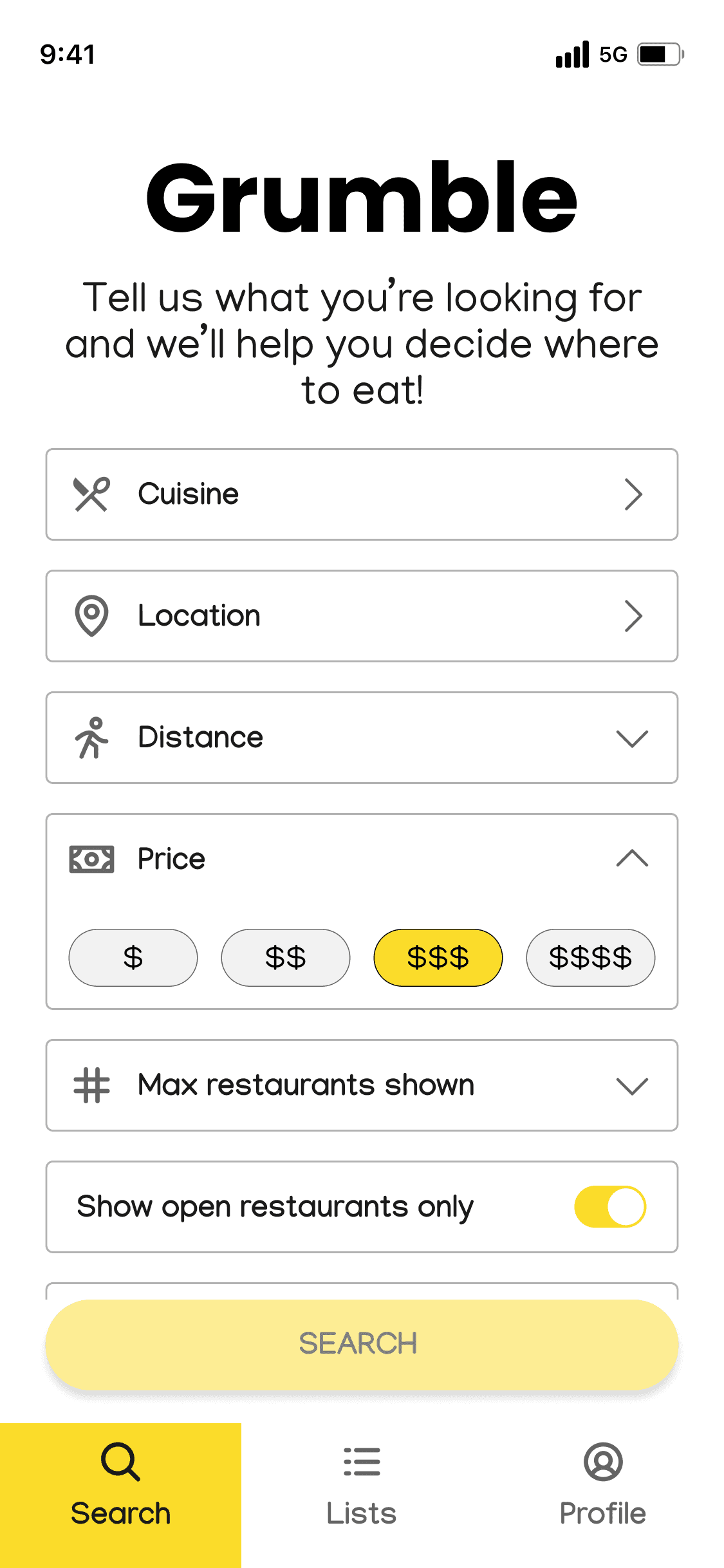
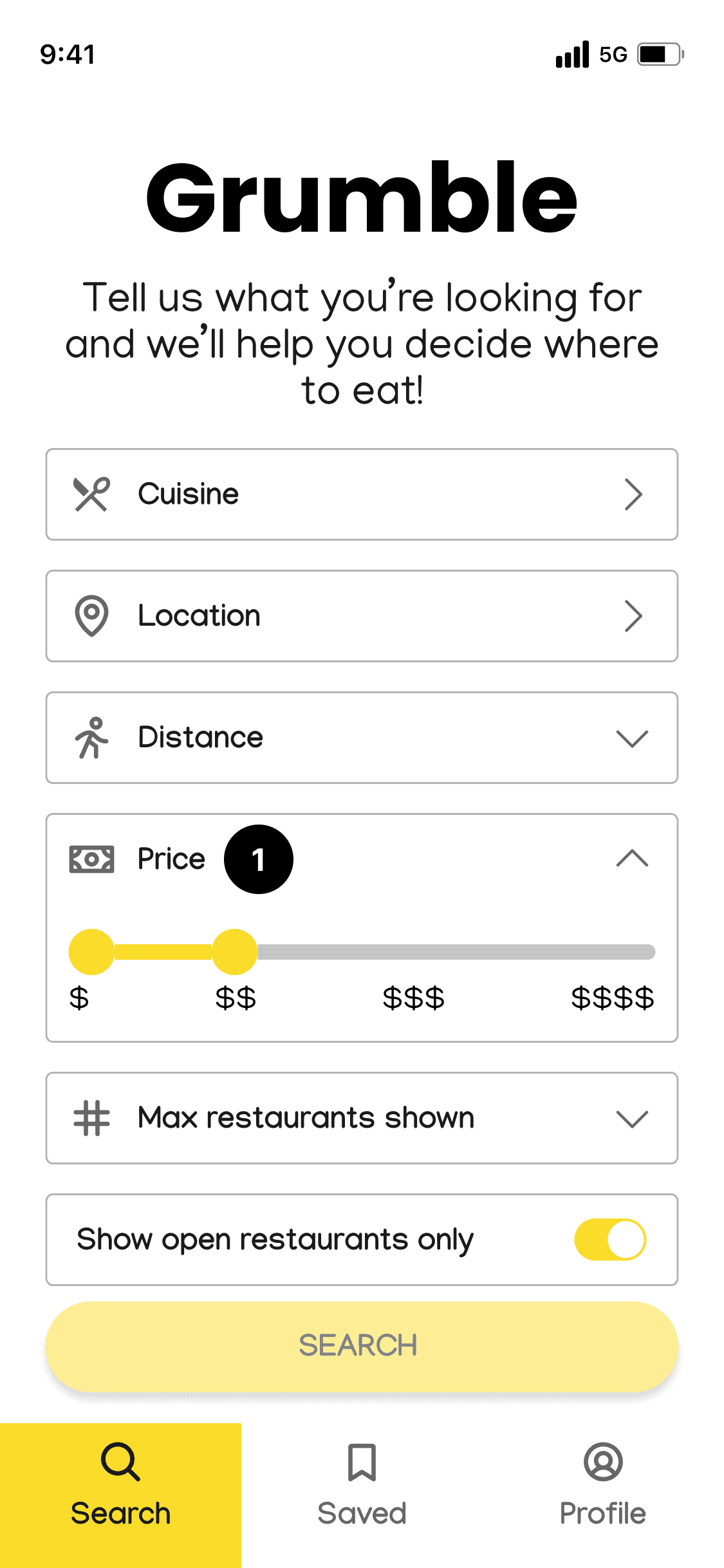
Reduce Ambiguity When Using the Price Filter
5 of 6 users only chose $$$ to get restaurant results up to that price amount when I expected them to choose $, $$, $$$.
Before
After
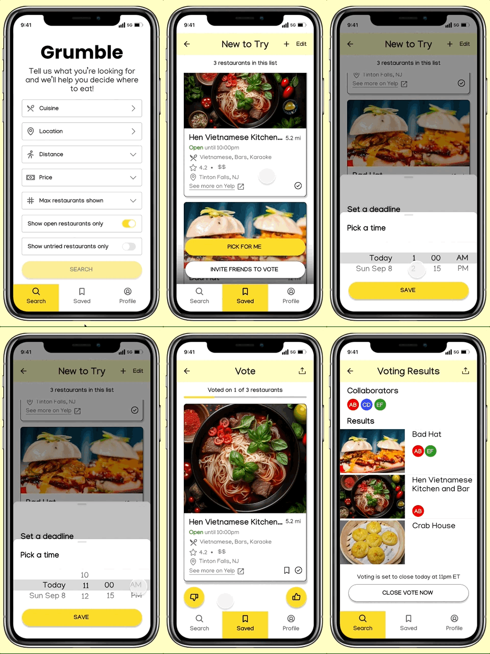
Search and Use the ‘Pick for Me’ Feature

Use a List to Invite Friends to Vote
Learnings
Next Steps
Conduct another round of usability testing with the current prototype. In the next round of testing, I would update the usability test to include an extra task instructing the user to save a restaurant they would like to try for later. This task should create a more natural flow so the user understands the functionality of the ‘Saved’ feature. I would also expand the last task where I ask users to “share saved restaurants with friends to vote”, adding that they also vote on the restaurants themselves. This will allow users to fully experience this feature and give their feedback.
Key Insights
Designing the cards was a challenge. Feedback from users was that they wanted as much restaurant information as possible on the restaurant card to more easily make their decision without having to always be redirected to Yelp and outside of the app. It was a balance of putting as much information as possible like users wanted, while prioritizing what information was most relevant to not overcrowd the card and mobile screen.
